3.2 Rules of the data visualisation game
Contents
3.2 Rules of the data visualisation game
A figure is not the data itself, it is the data viewed from one of many possible perspectives.
Good figures differ from bad figures by how easily readers can interpret the information the designer wanted to convey. Here, we look at components of figures which make them clearer and more understandable.
To illustrate these we will use data on Covid-19 hosted by our world in data.
First, we will import that packages we will use.
import pandas as pd
import numpy as np
import seaborn as sns
import matplotlib.pyplot as plt
import matplotlib.colors as colors #we will need this later

plt.style.use('seaborn')
sns.set_theme(style="whitegrid")
sns.set_style("white")
/tmp/ipykernel_2536/3413809515.py:7: MatplotlibDeprecationWarning: The seaborn styles shipped by Matplotlib are deprecated since 3.6, as they no longer correspond to the styles shipped by seaborn. However, they will remain available as 'seaborn-v0_8-<style>'. Alternatively, directly use the seaborn API instead.
  plt.style.use('seaborn')
Mapping data onto Aesthetics
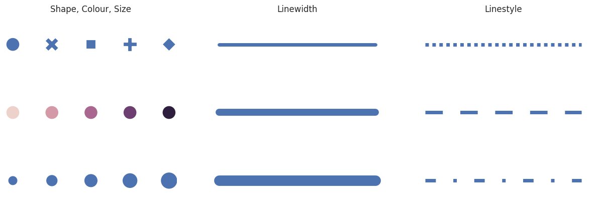
Figure creation is the process of mapping data to a graphical representation. We call these aesthetics.
Aesthetics may have some or all of the following components:
# fake data
n = 5
x = np.arange(n)
y = [1] * n

f, axes = plt.subplots(3,3, figsize=(15,5))

#shape, size, colour,
minsize=400
sns.scatterplot(x=x,y=y, ax=axes[0,0], style=x, legend=False, s=minsize)
sns.scatterplot(x=x,y=y, ax=axes[1,0], hue=x, legend=False, s=minsize)
sns.scatterplot(x=x,y=y, ax=axes[2,0], size=x, legend=False, sizes=(minsize*.5,minsize*1.5))

# line width
lw =5
sns.lineplot(x=x, y=y, ax=axes[0,1], size=y, legend=False, sizes=[lw])
sns.lineplot(x=x, y=y, ax=axes[1,1], size=y, legend=False, sizes=[lw*2])
sns.lineplot(x=x, y=y, ax=axes[2,1], size=y, legend=False, sizes=[lw*3])

# linestyle
sns.lineplot(x=x, y=y, ax=axes[0,2], style=y, size=y, legend=False, dashes=[(1,1)], sizes=[lw])
sns.lineplot(x=x, y=y, ax=axes[1,2], style=y, size=y, legend=False, dashes=[(5,5)], sizes=[lw])
sns.lineplot(x=x, y=y, ax=axes[2,2], style=y, size=y, legend=False, dashes=[(3,5,1,5)], sizes=[lw])

def remove_axes(ax):

    """ remove spines and ticks from a given axes """
    ax.set(yticklabels=[])
    ax.set(xticklabels=[])
    ax.tick_params(left=False, bottom=False)
    sns.despine(ax=ax, top=True,right=True,left=True,bottom=True)


for ax in axes.flatten(): remove_axes(ax)

#Set titles
axes[0,0].set_title('Shape, Colour, Size')
axes[0,1].set_title('Linewidth')
axes[0,2].set_title('Linestyle')

plt.show()
Coordinate Systems and Axes
In addition to those properties outlined above, every aesthetic element also has a position. The position is given relative to a set of position scales which have a particular geometric arrangement. This is called a coordinate system.
Let’s load the data.
url = 'https://raw.githubusercontent.com/owid/covid-19-data/master/public/data/owid-covid-data.csv'
df = pd.read_csv(url, parse_dates=['date'])
df.head()
| iso_code | continent | location | date | total_cases | new_cases | new_cases_smoothed | total_deaths | new_deaths | new_deaths_smoothed | ... | male_smokers | handwashing_facilities | hospital_beds_per_thousand | life_expectancy | human_development_index | population | excess_mortality_cumulative_absolute | excess_mortality_cumulative | excess_mortality | excess_mortality_cumulative_per_million | |
|---|---|---|---|---|---|---|---|---|---|---|---|---|---|---|---|---|---|---|---|---|---|
| 0 | AFG | Asia | Afghanistan | 2020-02-24 | 5.0 | 5.0 | NaN | NaN | NaN | NaN | ... | NaN | 37.746 | 0.5 | 64.83 | 0.511 | 41128772.0 | NaN | NaN | NaN | NaN |
| 1 | AFG | Asia | Afghanistan | 2020-02-25 | 5.0 | 0.0 | NaN | NaN | NaN | NaN | ... | NaN | 37.746 | 0.5 | 64.83 | 0.511 | 41128772.0 | NaN | NaN | NaN | NaN |
| 2 | AFG | Asia | Afghanistan | 2020-02-26 | 5.0 | 0.0 | NaN | NaN | NaN | NaN | ... | NaN | 37.746 | 0.5 | 64.83 | 0.511 | 41128772.0 | NaN | NaN | NaN | NaN |
| 3 | AFG | Asia | Afghanistan | 2020-02-27 | 5.0 | 0.0 | NaN | NaN | NaN | NaN | ... | NaN | 37.746 | 0.5 | 64.83 | 0.511 | 41128772.0 | NaN | NaN | NaN | NaN |
| 4 | AFG | Asia | Afghanistan | 2020-02-28 | 5.0 | 0.0 | NaN | NaN | NaN | NaN | ... | NaN | 37.746 | 0.5 | 64.83 | 0.511 | 41128772.0 | NaN | NaN | NaN | NaN |
5 rows × 67 columns
We can see that each country row is for a specific date for a given country. To illustrate the importance of coordinate systems let us assess how wealth inequalities affects the spread of COVID-19. To do this we will use the cumulative number of cases variable. However, if a country has more people it clearly may have more cases. So we will visualise the total_cases_per_million, which is normalised against population, against a measure of economic output per citizen, gdp_per_capita.
Normalisation is a key consideration in data visualisation. Normalisation is the process of ensuring that variables are measured on the same scale. In this example, total cases has been divided by population (in millions), so that the variable is comparable across countries with different populations.
df_countries = df[df['continent'].notna()]

# select 'iso_code', 'location', 'gdp_per_capita' and any columns that start with 'total'
df_totals = df_countries.query('population > 1e+6').filter(regex="iso|loc|pop|cont|total|gdp *", axis = 1).groupby('location').max()
sns.relplot(data=df_totals, x = 'gdp_per_capita', y = 'total_cases_per_million')
remove_axes(plt.gca())
plt.show()
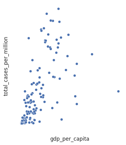
This plot is next to useless without a coordinate system for us to interpret the graph. Though it does have labels!
The most common coordinate system is Cartesian. In a cartesian coordinate system each point is uniquely specified by a numeric pair \((x,y)\), where \(x\) corresponds to a position along the horizontal axis (the abscissa) and \(y\) refers to a position along the vertical axis (the ordinate).
The two axes can have different units. In our example a single unit increase in total_cases_per_million is means a very different thing to a single unit increase in gdp_per_capita.
sns.relplot(data=df_totals, x = 'gdp_per_capita', y = 'total_cases_per_million')
plt.show()
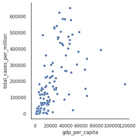
Adding axes improves matters a little (we at least know the direction of the axes), but clearly the current coordinate system is a poor choice for seeing patterns in the data since all the data is bunched at low y-axis values of total_cases_per_million.
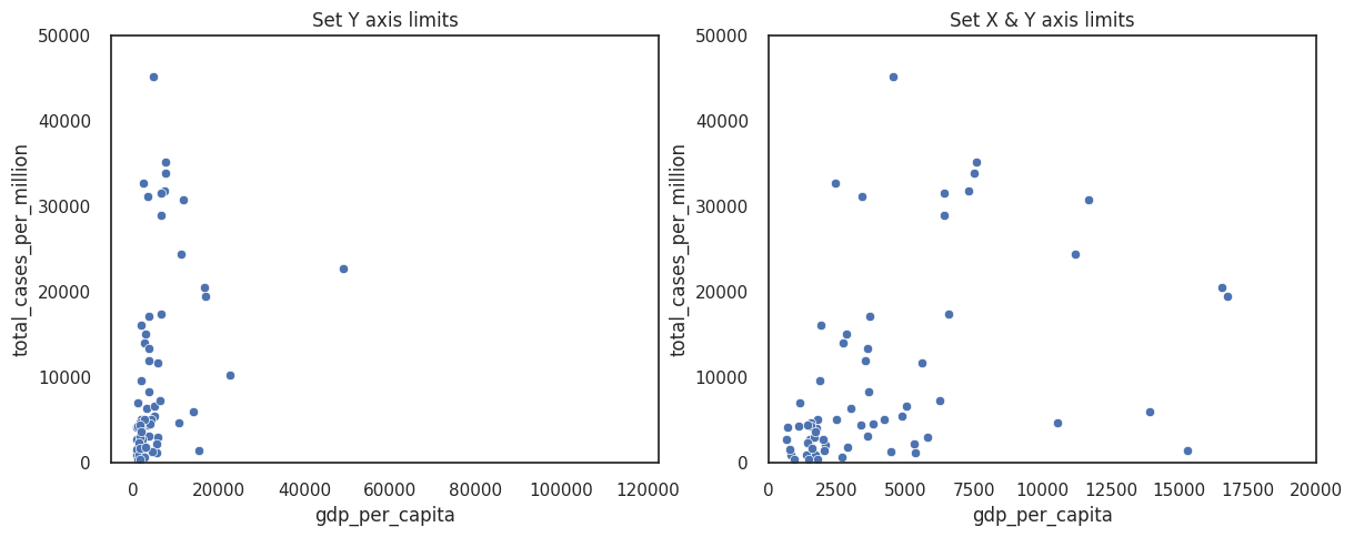
You can improve the figure by modifying the axes limits. By default, most plotting libraries match these limits to your data, but if you have outliers this may be inappropriate.
Setting limits keeps the same units along your axes but excludes data that falls outside your limits.
f, axes = plt.subplots(1,2, figsize =(14,5))

# set limit for total cases
sns.scatterplot(data=df_totals, x = 'gdp_per_capita', y = 'total_cases_per_million', ax=axes[0])
axes[0].set_ylim([0, 50000])
axes[0].set_title('Set Y axis limits')

# set limit for X and Y
sns.scatterplot(data=df_totals, x = 'gdp_per_capita', y = 'total_cases_per_million', ax=axes[1])
axes[1].set_title('Set X & Y axis limits')
axes[1].set_ylim([0, 50000])
axes[1].set_xlim([0, 20000])

plt.show()
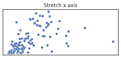
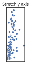
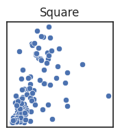
For most of these figures we are specifying the figure size for readability to avoid the x or y axis becoming overly long or short.
However, you can also deliberately alter how long each axes is compared to one another, called the aspect ratio of a figure, if doing so would help your message. If the units are different you generally stretch along the axes where the variation is the most important, in order to better see change in the variable.
Note that if the units are the same, stretching is misleading and a square figure is preferred.
See the blow examples of how stretching the axes changes the figure impression.
Scales and Transformations
The above are all Linear scales. Meaning that within the axes limits each unit increase in the original data is represented as one unit increase in the figure, regardless of value position along the axes.
It is also common to use non-linear scales when the pattern of the data is not well captured by linear scales.
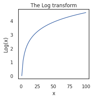
One of the most recognisable non-linear scale is the logarithmic scale.
The below figure shows how the logarithmic function exaggerates differences at the lower end of a linear scale and squashes data higher up. When applying a log scale you are transforming each data point, \(x\) to \(log(x)\). The numpy function np.log() uses the natural logarithmic function, which returns the power that you would need to raise the natural number \(e\) by to get \(x\).
That is, if \(x = e^y\) then \(log(x) = y\). Powers are simply sequential multiplication, e.g., \(e^3 = e \times e \times e\), meaning that numbers being multiplied get large quickly. At large powers, therefore, you do not need to multiply the number by very much at all to result in big absolute differences, which is why the \(log(x)\) function flattens out at as \(x\) becomes large.
The left figure shows the total cases on the log scale. The natural interpretation is that the difference between 5 and 10 cases is conceptually huge (i.e., it doubles) compared to the difference between 1005 and 1010 cases. The benefits here are that we do not need to exclude data.
Note that gdp_per_capita remains clustered at low values. Possibly the graph may be clearer if we plotted gdp per capita on the log scale. This makes some sense given the classic phrase the rich get richer, meaning that the richer a country is the more resources and investment they have to drive further economic growth.
The right figure plots our data in log-log coordinates. This seems to be the clearest coordinate system for us, and we can see that the total cases increases with GDP per capita.
f, axes = plt.subplots(1,2, figsize =(10,5))

def loglog(ax, xscale = 'log', yscale='log', ylab='Log (Total Cases)', xlab = 'Log (GDP Per Capita)'):
    ax.set_yscale(yscale)
    ax.set_xscale(xscale)
    ax.set_ylabel(ylab)
    ax.set_xlabel(xlab)


# log y-axes
sns.scatterplot(data=df_totals, x = 'gdp_per_capita', y = 'total_cases_per_million', ax=axes[0])
axes[0].set_yscale('log')
axes[0].set_title('Log Y, Linear X')
axes[0].set_ylabel('Log (Total Cases)')

# log x-axes and log y-axes
sns.scatterplot(data=df_totals, x = 'gdp_per_capita', y = 'total_cases_per_million', ax=axes[1])
loglog(axes[1])
axes[1].set_title('Log-Log coordinates')


plt.show()
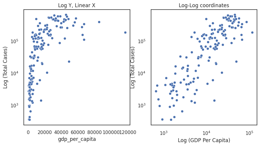
When we scale data using a plotting api it can be tempting to think that this is somehow different to transforming the underlying data then plotting without scaling. Both approaches are identical. Scaling is simply applying a function to the data values: \(x_s = f(x)\), where \(x_s\) is the scaled/transformed value. When calling set_yscale() there are some default scales which are well-known functions (e.g., linear is simply \(x_s = x\)), but you can also apply any custom function.
Colour Scales
Though our log-log plot shows that there is a trend for increased cases for wealthier countries, there is much more information we could convey.
Coordinate systems tend to display two variables at a maximum, otherwise the figure can get cluttered.
If you want to convey more variables you can use additional scales to add dimensions.
Colour is the most common choice. You can use colour to represent both categorical and continuous data.
When used well colour can be an excellent way of adding information into your figure. However, do not rely solely on colour in your plots. Colourblindness affects about 8% of the population (1 in 12 men; 1 in 200 women: NHS site). This is a high proportion of your readers that may find your plot inaccessible (see this nice blog by Rachel Cravit at Venngage). There are different types of colour blindness, but the most common is “red-green” colourblindness, where individuals are less sensitive to the red and green shades in colours. Fortunately, there has been good research into coloursafe palettes, for example Okabe and Ito, 2008, and there are many available colour safe palettes (e.g., those from colourbrewer).
Categorical colour
For example, we may want to indicate the spread of countries across the continents, given in the bottom left figure below.
Colour is much more expressive than shape, as shown by the lack of clarity in the middle example. One could use both (right-most figure), but redundant coding is to be avoided because it forces the reader to do unnecessary work.
f, axes = plt.subplots(1,3, figsize =(15,6))

# plot with a default palette
sns.scatterplot(data=df_totals, x = 'gdp_per_capita', y = 'total_cases_per_million', hue='continent', ax=axes[0])
axes[0].set_yscale('log')
axes[0].set_xscale('log')
axes[0].set_ylabel('Log (Total Cases)')
axes[0].set_xlabel('Log (GDP Per Capita)')

sns.scatterplot(data=df_totals, x = 'gdp_per_capita', y = 'total_cases_per_million', style='continent', ax=axes[1])
axes[1].set_yscale('log')
axes[1].set_xscale('log')
axes[1].set_ylabel('Log (Total Cases)')
axes[1].set_xlabel('Log (GDP Per Capita)')
axes[1].set_title('POOR - shapes as categories')

sns.scatterplot(data=df_totals, x = 'gdp_per_capita', y = 'total_cases_per_million', hue='continent', style='continent', ax=axes[2])
axes[2].set_yscale('log')
axes[2].set_xscale('log')
axes[2].set_ylabel('Log (Total Cases)')
axes[2].set_xlabel('Log (GDP Per Capita)')
axes[2].set_title('Unnecessary redundant coding')

plt.show()
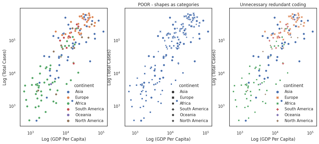
By default seaborn maps data labels into the legend and places the legend in a position on the figure where it least interferes with the data. In a lot of cases these defaults are not good enough (for example our continent legend confusingly overlaps a dot representing an Asian country). Fortunately, legends are very customisable, and you will see some minor examples of customising legends throughout the code in this course. For more detailed examples see the matplotlib legend docs and legend guide. There are also many blogs available such as this one.
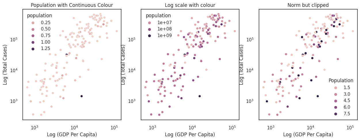
Continuous Colour
We might also want to map data values to a continuous colour scale. However, as with any scale the distribution of your data is important.
The plots below assess whether the size of a country influences the total number of cases.
The first plot applies a linear scale from Colour values to population. This is not very informative because China and India are so much more populous than the other countries.
Since we have mapped data values to colour (i.e., applied a scale) in much the same way as we have mapped data values to position (in the Cartesian coordinate system), we can apply limits or transform the scale.
The middle plot passes a log transform to the colour scale. This is an improvement, but there remains many similar colours in the middle of the colour scale that are hard to distinguish. We want to use more of the extreme ends of the colour scale.
The right plot clips the colour scale at the 10th and 90th percentiles. This reduces the influence of outliers on the scale and helps the readability of the plot by allowing us to pick out the small and large countries.
# TODO: make setting the labels into a convenience function

f, axes = plt.subplots(1,3, figsize =(15,5))

# plot with a default palette
sns.scatterplot(data=df_totals, x = 'gdp_per_capita', y = 'total_cases_per_million', hue='population', ax=axes[0])
axes[0].set_yscale('log')
axes[0].set_xscale('log')
axes[0].set_title('Population with Continuous Colour')
axes[0].set_ylabel('Log (Total Cases)')
axes[0].set_xlabel('Log (GDP Per Capita)')


# make our own color_palette.
lognorm = colors.LogNorm(df_totals['population'].min(),df_totals['population'].max())

# log x-axes and log y-axes
sns.scatterplot(data=df_totals, x = 'gdp_per_capita', y = 'total_cases_per_million', hue='population', hue_norm = colors.LogNorm(), ax=axes[1])
axes[1].set_yscale('log')
axes[1].set_xscale('log')
axes[1].set_title('Log scale with colour')
axes[1].set_ylabel('Log (Total Cases)')
axes[1].set_xlabel('Log (GDP Per Capita)')


#normalise with a clip.

# remove nans.
pop_dens = df_totals['population'].dropna()
q_min = np.quantile(pop_dens, .1)
q_max = np.quantile(pop_dens, .9)
norm = colors.Normalize(q_min,
                        q_max,
                       clip=True)

# Seaborn and matplotlib have a bug of not being able to show your own values
# we need to pass the clipped values to `hue`, otherwise matplotlib will not show appropriate values since the legend creator picks linear values between min and max
sns.scatterplot(data=df_totals, x = 'gdp_per_capita', y = 'total_cases_per_million', hue=np.clip(df_totals['population'].values, q_min, q_max) , hue_norm = norm, ax=axes[2], legend='brief')

axes[2].set_yscale('log')
axes[2].set_xscale('log')
axes[2].set_title('Norm but clipped')
axes[2].set_ylabel('Log (Total Cases)')
axes[2].set_xlabel('Log (GDP Per Capita)')
axes[2].legend(title='Population', loc='lower right')
plt.show()

# TODO: fix legend labels to be in te same units
Size
It is also common to use size as an additional dimension.
Since size always has direction you risk implying a false order if you use it for categorical variables. You should therefore only use size for a continuous scale.
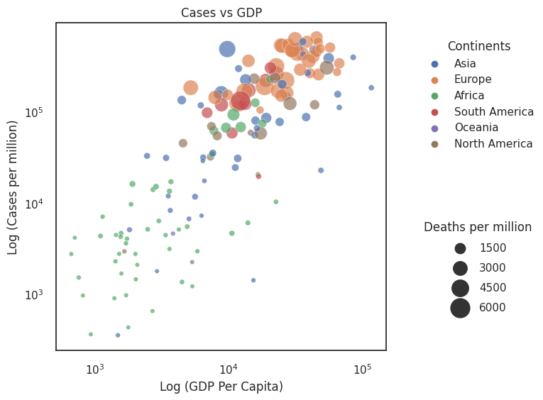
In the figure entitled Cases vs GDP we use size to indicate total deaths. By doing this we can begin assessing countries that did comparatively well in managing high case numbers (countries that are high up the y-axis but have a small size).
Let’s pause a moment. There is quite a lot to consider in this plot. We are asking quite a lot of the reader. Reflect on what we want to investigate - do richer countries deal better with cases, and how is this spread across the world?
Sometimes it is worth reconsidering your axes to bring clarity to your message. In order of information importance it should be:
Position
Colour
Size
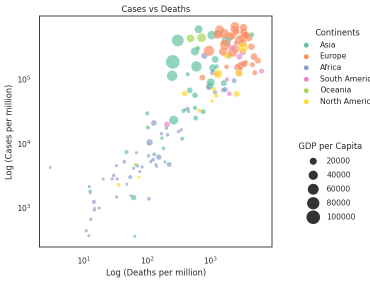
The figure entitled Cases vs Deaths presents the same data but with Cases and Deaths along the axes (i.e., position scales) and size representing the GDP. How has this changed the interpretation of the data?
Overplotting. Do not underestimate the difficulty of interpreting visualisations. Here we use multiple scales for demonstration purposes, but in practice these figures are a little cluttered and unintuitive. One would think of ways of reducing the complexity of the figure. In this example, an ordered bar or dot chart (see Section 3.3) plotting the ratio of total_cases_per_million / total_deaths_per_million would be a cleaner graph.
f, ax = plt.subplots(1,1, figsize=(6,6))
sns.scatterplot(data=df_totals, x = 'gdp_per_capita', y = 'total_cases_per_million', size='total_deaths_per_million', sizes=(20,400), hue='continent', legend='brief', ax=ax, alpha = .7)
ax.set_yscale('log')
ax.set_xscale('log')
ax.set_ylabel('Log (Cases per million)')
ax.set_xlabel('Log (GDP Per Capita)')
ax.set_title('Cases vs GDP')

# separate legends
# solution retrieved from https://stackoverflow.com/questions/56456956/separate-seaborn-legend-into-two-distinct-boxes
h,l = ax.get_legend_handles_labels()
l1 = ax.legend(h[1:7],l[1:7], loc=(1.1,.6), title='Continents')
l2 = ax.legend(h[8:],l[8:], loc=(1.1, .1), title='Deaths per million', labelspacing=.85)
ax.add_artist(l1)


plt.show()

f, ax = plt.subplots(1,1, figsize=(6,6))
sns.scatterplot(data=df_totals, x = 'total_deaths_per_million', y = 'total_cases_per_million', size='gdp_per_capita', sizes=(20,400), hue='continent', legend='brief', ax=ax, alpha = .7, palette="Set2")
ax.set_yscale('log')
ax.set_xscale('log')
ax.set_ylabel('Log (Cases per million)')
ax.set_xlabel('Log (Deaths per million)')
ax.set_title('Cases vs Deaths')
ax.legend(title='Continent', loc='lower right')

h,l = ax.get_legend_handles_labels()
l1 = ax.legend(h[1:7],l[1:7], loc=(1.1,.6), title='Continents')
l2 = ax.legend(h[8:],l[8:], loc=(1.1, .1), title='GDP per Capita', labelspacing=.85)
ax.add_artist(l1)


plt.show()
This plot is far from perfect. Four dimensions on a plot is cluttered, and a scatter plot may not be the best method.
How would you improve the plot?
Think about what you find confusing in this plot, and how one might change it to improve the message.
We will send a hackmd link to interactively collate thoughts.
Colour schemes
There are many well-researched palettes to choose from. For example ColourBrewer have useful palettes that are distinct in black and white and also some that are colour blind safe. These are already included within a wide variety of other colour maps in matplotlib (see also Stefan van de Walt’s and Nathanial Smith’s Scipy2015 talk), and therefore also seaborn. When choosing a colour map think of whether your data is:
Sequential (perceptually uniform palettes are often best here to avoid different parts of the scale popping out)
Diverging
Qualitative/Categorical.
A good overview of the key considerations when picking a colour is giving in the seaborn tutorial of choosing a colour palette.
If you want to select your own colours that complement one another, useful resources are the xkcd colour survey, and the colour Calculator.
There is also this fantastic blog by Lisa from Datawrapper, which contains a lot of useful design tips and resources.
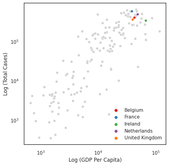
Colour to highlight
In addition to using colour as a categorical or continuous measure, you can also use colour as a tool to bring the readers’ attention to those areas that you are interested in. For example, if we were interested only in the UK and surrounding countries, we could grey all the other countries out (e.g., see Andy Kirk’s blog about the benefits of using grey).
Another way of using colour to highlight is with the use of accent colour scales, which contain both a set of subdued colours and a matching set of stronger, darker, and/or more saturated colours.
countries = ['United Kingdom','Ireland','France','Belgium','Netherlands']
other = 'Rest of World'
df_totals = df_totals.assign(highlight = [loc if loc in countries else other
                                       for loc in df_totals.index])

# pick a list of colours
cmap = sns.color_palette("Set1", n_colors=len(set(df_totals.highlight.values))-1)

f, ax = plt.subplots(1,1, figsize = (6,6))

# plot grey first so that the highlighted values are on top
sns.scatterplot(data=df_totals.query("highlight == @other"), x = 'gdp_per_capita', y = 'total_cases_per_million', color='lightgray')
sns.scatterplot(data=df_totals.query("highlight in @countries"), x = 'gdp_per_capita', y = 'total_cases_per_million', hue='highlight', palette=cmap)

ax.set_yscale('log')
ax.set_xscale('log')
ax.set_ylabel('Log (Total Cases)')
ax.set_xlabel('Log (GDP Per Capita)')
ax.legend(title='')
plt.show()
Annotations: labels, legends, titles
In constructing our plot so far we have been lazy with the labelling and legend creation.
You should always consider whether your chart title and labels are descriptive enough, and whether you could add other annotations that not only describe what is being measured but also why the reader should care about the chart.
Appropriate titles, labels, and annotations avoid misinterpretation and save time for the chart reader.
Further Examples
These further examples combine our previously covered knowledge of position scales and colour with appropriate annotations to bring clarity to the story.
Central role for Colour
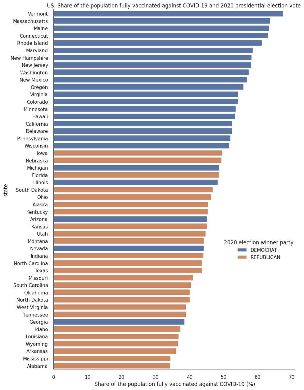
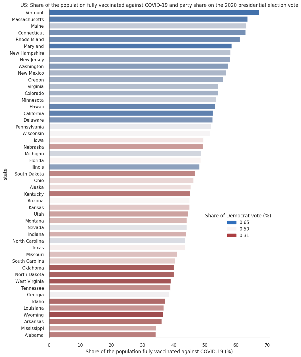
Since the 2020 presidential elections in the United States and the roll-out of the Covid-19 vaccination campaigns, there have been a number of data journalism articles exploring how vaccination rates vary between states with respect to their political leanings (for example, take a look at this npr article or this one from The New York Times). We think this is an interesting dataset, full of nuance, so we will use this example throughout the module to demonstrate some concepts of data visualisation, in this case the use of colour as information. We present this data without political comment, and invite you to explore the dataset and make your own conclusions.
The first plot below creates a categorical illustration of these states, using a qualitative colour scale.
Qualitative colour scales consist of colours that are distinct from one another while also having no obvious order. This is good practice for presenting categorical data.
That plot shows a striking, binary view of a complex issue. The following plot shows a more nuanced picture by mapping political affiliation to a diverging colour scale.
import matplotlib.patches as mpatches
# read the data from here https://ourworldindata.org/us-states-vaccinations
df_vaccination = pd.read_csv('data/us-covid-share-fully-vaccinated.csv', sep=',', parse_dates=['Day'])

# look at max day avalaible for cumulative vaccination data
max_day = df_vaccination['Day'].max()
df_vaccination_max = df_vaccination[df_vaccination['Day']==max_day]

# get election data from here https://dataverse.harvard.edu/file.xhtml?fileId=4299753&version=6.0
df_president_2020 = pd.read_csv('data/2020-president.csv', sep=',')

df_president_2020 = df_president_2020[df_president_2020['year']==2020]

# making sure state names are compatible between datasets
df_president_2020['state'] = df_president_2020['state'].str.title()
# calculate percentage of votes for a party
df_president_2020['party_percentage'] = df_president_2020['candidatevotes']/df_president_2020['totalvotes']

# only select data from the winner party
index_list = []
for state in np.unique(df_president_2020['state']):
   max = df_president_2020[df_president_2020['state']==state]['party_percentage'].max()
   index =  (df_president_2020[(df_president_2020['state'] == state) & (df_president_2020['party_percentage']==max)].index.values[0])
   index_list.append(index)
df_president_2020_party = df_president_2020.loc[index_list]

# join the datasets
df_joined = pd.merge(df_vaccination_max,df_president_2020_party[['state','party_simplified','party_percentage']],left_on='Entity',right_on='state',how='inner')

# make percentage as a share of democrat vote (this is not 100% right, we don't consider other parties, however they are negligible).
df_joined.loc[df_joined[df_joined['party_simplified']=='REPUBLICAN'].index,'party_percentage'] = 1- df_joined[df_joined['party_simplified']=='REPUBLICAN']['party_percentage']
df_joined.sort_values(by='people_fully_vaccinated_per_hundred',inplace=True, ascending=False)


## PLOTS

# Use color a category
import matplotlib.pyplot as plt
sns.set_theme(style="whitegrid")
sns.set_style("white")

f, ax = plt.subplots(figsize=(10, 15))
# Load the dataset
ax = sns.barplot(x="people_fully_vaccinated_per_hundred", y="state", data=df_joined,hue='party_simplified',dodge=False)
ax.set_title('US: Share of the population fully vaccinated against COVID-19 and 2020 presidential election vote',fontsize=12)
ax.set_xlabel(' Share of the population fully vaccinated against COVID-19 (%)')
ax.legend(title="2020 election winner party", loc=(.7,.3))
sns.despine(left=False, bottom=False)
plt.show()

# Use color a scale
f2, ax2 = plt.subplots(figsize=(10, 15))
n = len(df_joined.state)
cmap = sns.color_palette("vlag_r", n_colors=n)
# Load the example car crash dataset
ax2 = sns.barplot(x="people_fully_vaccinated_per_hundred", y="state", data=df_joined,hue='party_percentage',dodge=False,palette=cmap)
ax2.set_title('US: Share of the population fully vaccinated against COVID-19 and party share on the 2020 presidential election vote',fontsize=12)
ax2.set_xlabel('Share of the population fully vaccinated against COVID-19 (%)')
sns.despine(left=False, bottom=False)
# Add a legend and informative axis label
sns.despine(left=False, bottom=False)
# Create a new legend
party_min = mpatches.Patch(color=cmap[0], label='{:.2f}'.format(df_joined['party_percentage'].min()))
party_med = mpatches.Patch(color=cmap[round(n/2)], label='{:.2f}'.format(.5))
party_max = mpatches.Patch(color=cmap[-1], label='{:.2f}'.format(df_joined['party_percentage'].max()))
ax2.legend(handles=[party_max,party_med,party_min],title='Share of Democrat vote (%)', loc=(.7,.3))
plt.show()
Aggregation
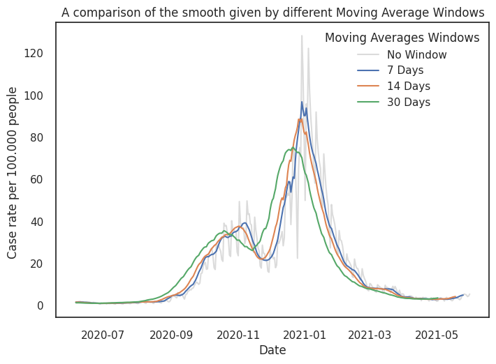
Beware of overplotting! There is only so much information that is useful in a plot. Often the variability in raw data obscures the message.
A powerful tool is aggregation. Aggregation involves applying calculations on your data set in order to collapse your data to a representative variable (for example, an average).
One should always take care when aggregating. There is a balance between reducing data information too far and miscommunication trends on one hand, and not reducing data enough and overloading the reader on the other.
A common form of aggregation is histograms, which we cover in the next section.
Below we showcase numbers in the England. The moving average can provide a balance between reduction and complexity, dependent on the window in which you average over.
windows = [7,14,30]

df_uk_cases = pd.read_csv('data/data_2021-Aug-01.csv', sep=',', parse_dates=['date'])

# select 1 year data (360 days)
df_uk_cases_1y = df_uk_cases[(df_uk_cases['date']>='2020-06-06') & (df_uk_cases['date']<'2021-06-01')].copy()

# normalise case per population
def normalise(cases,country):
    # population estimates from https://www.ons.gov.uk/peoplepopulationandcommunity/populationandmigration/populationestimates/datasets/populationestimatesforukenglandandwalesscotlandandnorthernireland
    norm =  {'England': 56550138, 'Wales': 3169586, 'Scotland': 5466000, 'Northern Ireland': 1895510}
    return cases / norm[country] *100000

df_uk_cases_1y['casesNormalised'] = df_uk_cases_1y.apply(lambda row: normalise(row.newCasesBySpecimenDate, row.areaName),axis=1)

# Plotting typical time series plot with different average windows
df_eng = df_uk_cases_1y.query("areaName == 'England'")
sns.lineplot(data = df_eng, x = 'date', y='casesNormalised', color = "lightgray", label='No Window', alpha = .8)
for w in windows:
    y = df_eng['casesNormalised'].rolling(window=w).mean()
    sns.lineplot(x=df_eng.date.values,y=y,label=f"{w} Days")

plt.xlabel("Date")
plt.ylabel("Case rate per 100.000 people ")
plt.legend(title='Moving Averages Windows')
plt.title('A comparison of the smooth given by different Moving Average Windows')
plt.show()