3.5 Walkthrough: visualisation for data exploration
Contents
3.5 Walkthrough: visualisation for data exploration
In this last section we are going dig back into our EQLTS survey dataset and use some data visualisation tools we covered in the previous sections to better understand our dataset.
A reminder of our Research question:
We want to investigate the contribution of material, occupational, and psychosocial factors on the self reported health (SRH) across different European countries. We will use SRH information collected by the Wave 2 and 3 of the EQLTS survey, aware that they offer only a partial representation of European populations and that SRH is per-se a highly subjective indicator, difficult to compare across countries.
Aside from Aldabe et al. paper
We are using the Aldabe et al. 2011, paper as a guideline into our analysis, let’s have a quick recap. The study uses the following variables:
The main model used socio-economic status information (occupation and education level survey question) and age to predict SRH (age was included to control for it).
Additional models were tested that included a rather large list of material, occupational and psychosocial variables to test if they mediate the relationship. See Table 1 in the paper.
The majority of responses were in “good” health (81.14% of men; 76.91% of woman).
In general, we are interested in exploring predictors that are general (some questions are quite specific).
We can access the data by downloading the csv option from here. You would have downloaded a folder with the following directory structure. Here we have only listed the files which we will use:
UKDA-7724-csv
csv # here is the data
eqls_2011.csv
mrdoc #here is additional info
allissue #data dictionaries
excel
eqls_api_map.csv # description of what the column names mean
eqls_concordance_grid.xlxs #described which variables were included in which waves and the mapping between waves
pdf # user guide
UKDA #study info
Create a folder data in the same root as this notebook. Copy the folder UKDA-7724-csv and its contents there.
In the data set there are 195 variables but many were not included in wave 3 - eqls_concordance_grid.xlsx states which. For simplicity in this example we will only use wave 3 data.
Reading the data
Let’s start reading wave 3 data eqls_2011.csv
import pandas as pd
import seaborn as sns
import matplotlib.pyplot as plt
import numpy as np

plt.style.use('seaborn')
sns.set_theme(style="whitegrid")
sns.set_style("white")
datafolder = './data/UKDA-7724-csv/'
df11 = pd.read_csv(datafolder + 'csv/eqls_2011.csv')
df11.describe()
| Wave | Y11_Country | Y11_Q31 | Y11_Q32 | Y11_ISCEDsimple | Y11_Q49 | Y11_Q67_1 | Y11_Q67_2 | Y11_Q67_3 | Y11_Q67_4 | ... | DV_Q7 | DV_Q67 | DV_Q43Q44 | DV_Q54a | DV_Q54b | DV_Q55 | DV_Q56 | DV_Q8 | DV_Q10 | RowID | |
|---|---|---|---|---|---|---|---|---|---|---|---|---|---|---|---|---|---|---|---|---|---|
| count | 43636.0 | 43636.000000 | 43392.000000 | 43410.000000 | 43545.000000 | 43541.000000 | 43636.000000 | 43636.000000 | 43636.000000 | 43636.000000 | ... | 1131.000000 | 43636.000000 | 43214.000000 | 43636.000000 | 43636.000000 | 43636.000000 | 43636.000000 | 43636.000000 | 43636.000000 | 43636.00000 |
| mean | 3.0 | 17.317192 | 1.880969 | 1.573485 | 4.076886 | 2.671735 | 1.959368 | 1.023673 | 1.019204 | 1.001971 | ... | 53.019452 | 1.086465 | 2.482390 | 2.815565 | 2.925635 | 0.303442 | 0.231437 | 3.931708 | 3.283482 | 57452.50000 |
| std | 0.0 | 9.470192 | 1.197339 | 1.268200 | 1.377113 | 0.972558 | 0.197437 | 0.152030 | 0.137244 | 0.044351 | ... | 16.056085 | 0.460388 | 0.837227 | 0.721642 | 0.568403 | 0.881979 | 0.827727 | 0.436254 | 1.130667 | 12596.77251 |
| min | 3.0 | 1.000000 | 1.000000 | 0.000000 | 1.000000 | 1.000000 | 1.000000 | 1.000000 | 1.000000 | 1.000000 | ... | 5.000000 | 1.000000 | 1.000000 | 1.000000 | 1.000000 | 0.000000 | 0.000000 | 1.000000 | 1.000000 | 35635.00000 |
| 25% | 3.0 | 9.000000 | 1.000000 | 0.000000 | 3.000000 | 2.000000 | 2.000000 | 1.000000 | 1.000000 | 1.000000 | ... | 43.000000 | 1.000000 | 2.000000 | 3.000000 | 3.000000 | 0.000000 | 0.000000 | 4.000000 | 2.000000 | 46543.75000 |
| 50% | 3.0 | 17.000000 | 1.000000 | 2.000000 | 4.000000 | 3.000000 | 2.000000 | 1.000000 | 1.000000 | 1.000000 | ... | 51.000000 | 1.000000 | 3.000000 | 3.000000 | 3.000000 | 0.000000 | 0.000000 | 4.000000 | 4.000000 | 57452.50000 |
| 75% | 3.0 | 26.000000 | 3.000000 | 2.000000 | 5.000000 | 4.000000 | 2.000000 | 1.000000 | 1.000000 | 1.000000 | ... | 63.000000 | 1.000000 | 3.000000 | 3.000000 | 3.000000 | 0.000000 | 0.000000 | 4.000000 | 4.000000 | 68361.25000 |
| max | 3.0 | 34.000000 | 4.000000 | 5.000000 | 8.000000 | 4.000000 | 2.000000 | 2.000000 | 2.000000 | 2.000000 | ... | 80.000000 | 6.000000 | 3.000000 | 6.000000 | 6.000000 | 4.000000 | 4.000000 | 4.000000 | 4.000000 | 79270.00000 |
8 rows × 196 columns
Variables, topics, and groupings
We have many variables (196) with coded names. We need to use the eqls_api_map.csv to understand what each of these columns mean.
df_map = pd.read_csv(datafolder + 'mrdoc/excel/eqls_api_map.csv', encoding='latin1')

df_map.head(100)
| VariableName | VariableLabel | Question | TopicValue | KeywordValue | VariableGroupValue | |
|---|---|---|---|---|---|---|
| 0 | Wave | EQLS Wave | EQLS Wave | NaN | NaN | Administrative Variables |
| 1 | Y11_Country | Country | Country | Geographies | NaN | Household Grid and Country |
| 2 | Y11_Q31 | Marital status | Marital status | Social stratification and groupings - Family l... | Marital status | Family and Social Life |
| 3 | Y11_Q32 | No. of children | Number of children of your own | Social stratification and groupings - Family l... | Children | Family and Social Life |
| 4 | Y11_ISCEDsimple | Education completed | Highest level of education completed | Education - Higher and further | Education levels | Education |
| ... | ... | ... | ... | ... | ... | ... |
| 95 | Y11_Q25e | How much tension between different racial/ethn... | How much tension is there in this country: Dif... | Society and culture - Social attitudes and beh... | Disadvantaged groups | Quality of Society |
| 96 | Y11_Q25f | How much tension between different religious g... | How much tension is there in this country: Dif... | Society and culture - Social attitudes and beh... | Disadvantaged groups | Quality of Society |
| 97 | Y11_Q25g | How much tension between groups with different... | How much tension is there in this country: Gro... | Society and culture - Social attitudes and beh... | Disadvantaged groups | Quality of Society |
| 98 | Y11_Q28a | How much trust the parliament? | How much you personally trust: [NATIONALITY] p... | Society and culture - Social attitudes and beh... | Trust | Quality of Society |
| 99 | Y11_Q28b | How much trust the legal system? | How much you personally trust: The legal system? | Society and culture - Social attitudes and beh... | Trust | Quality of Society |
100 rows × 6 columns
Notes from the User Guide
Variables are grouped into primary and secondary topics (e.g., Education - Higher and further).
Variables are also grouped into variable groupings which differ slightly from the topics.
The topics are an attempt to succinctly describe the semantic domain of each variable. The variable groupings are slightly overlapping with these topics (e.g Health crops up twice), but also includes indicators such as ‘Derived Variables’, which clearly is a technical grouping rather than a topic.
Derived variables “group numeric responses of other related variables or to collapse groupings of related categorical variables into fewer categories”. The derived variables are potentially useful, since they aim to:
enhance the data quality by aggregating the responses into more usable and consistent format across both waves of the Survey
provide a clearer structure of datasets by reducing the number of variables
ensure confidentiality and anonymity of personal information and all respondents
The derived variables are not necessarily the most important questions, they simply occur when there are many related questions which can be aggregated.
Let’s take a look at the grouping of variables and how many questions are in each group.
# all Groups
sns.countplot(y="VariableGroupValue", data=df_map, palette="Accent")
<AxesSubplot:xlabel='count', ylabel='VariableGroupValue'>
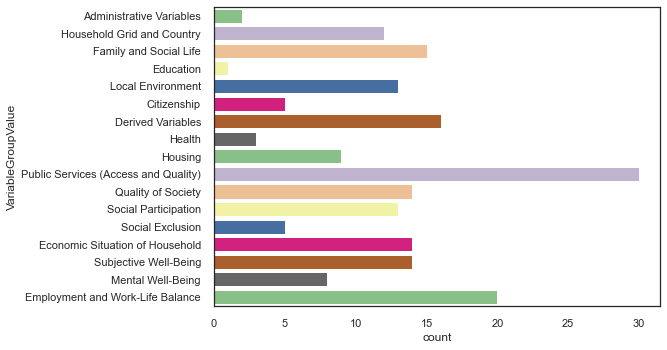
Public Services are the group that has the highest number of questions associated to it, followed by Employment and Work-Life Balance. Education and Health appear to have just a few questions.
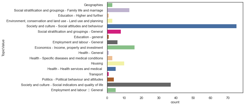
Let’s look now how the questions distribute around Topics.
# all topics
sns.countplot(y="TopicValue", data=df_map, palette="Accent")
<AxesSubplot:xlabel='count', ylabel='TopicValue'>
/anaconda3/envs/clase25datos/lib/python3.7/site-packages/matplotlib/backends/backend_agg.py:240: RuntimeWarning: Glyph 150 missing from current font.
  font.set_text(s, 0.0, flags=flags)
/anaconda3/envs/clase25datos/lib/python3.7/site-packages/matplotlib/backends/backend_agg.py:203: RuntimeWarning: Glyph 150 missing from current font.
  font.set_text(s, 0, flags=flags)
Now, let’s explore how the TopicValue and VariableGroupValue map to each other. Furthermore, since the derived variables were made specifically to make the dataset easier to use let’s have a look at these and see how they map onto material, occupational, and psychosocial factors.
heatmap1_data = pd.pivot_table(df_map, index=['TopicValue'],values='VariableName',columns=['VariableGroupValue'], aggfunc=lambda x: len(x.unique()))
sns.heatmap(heatmap1_data, cmap="YlGnBu")
plt.xticks(
    rotation=45,
    horizontalalignment='right',
    fontweight='light',
    #fontsize='x-large'
)
None
/anaconda3/envs/clase25datos/lib/python3.7/site-packages/matplotlib/backends/backend_agg.py:240: RuntimeWarning: Glyph 150 missing from current font.
  font.set_text(s, 0.0, flags=flags)
/anaconda3/envs/clase25datos/lib/python3.7/site-packages/matplotlib/backends/backend_agg.py:203: RuntimeWarning: Glyph 150 missing from current font.
  font.set_text(s, 0, flags=flags)
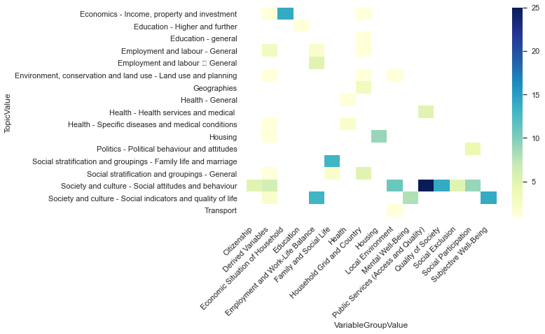
As expected there is not a 1:1 mapping between these two categories, and we only have a subset of topics covered by our derived variables. If we revisit the table above with some consideration we can sensibly group the derived variable topics as follows.
Material
Economics - Income, property and investment
Environment, conservation and land use - Land …
Housing
Occupational
Employment and labour - General
Psychosocial
Social stratification and groupings - General
Society and culture - Social attitudes and beh…
Let’s have a closer look at these variables using eqls_2011_ukda_data_dictionary.rtf. We have also had a manual scan of eqis_api_map and included promising looking variables in the list below.
Material Variables
Y11_Deprindex:Y11_Q59atoY11_Q59fask ‘Can house afford it if you want it?’, with six examples (home heating, holiday, replacing goods, good food, new clothes, hosting friends). The responses are categorical1(YES) or2(NO). TheY11_Deprindexis a count of the number of yes responses.Y11_RuralUrban: This variable simply condenses a previous question from four categories into two categories -1(rural) or2(urban).Y11_Accommproblems:Y11_Q19a-Y11_Q19fasks a1(YES) or2(NO) question about accommodation problems, with six examples. This variable is a count.Y11_HHsize: Household size including children (overlaps with social). Ranges from 1-4 where 4 is 4 or more.Y11_Q32: related to above, number of children. Ranges from 1-5 where 5 is 5 or more.Y11_Incomequartiles_percapitaranges from 1 (1st quartile) to 4 (4th quartile).
Occupational Variables
DV_Q7: Count from a couple of working hours questions. Varies from 80-5.Y11_ISCEDsimple: Education levels based on the International Standard Classification of Education (ISCED). Ranges from 1-8. Confusing, 1-7 is from no to high education. 8 means N/A.Y11_Education: related to above but less granular. 1-3 are primary -> tertiary. 4-6 are various catch answers.
Pychosocial Variables
Y11_SocExIndex: average score from four social exclusion question measures on a 5 scale response (1 = strongly disagree, 5 = strongly agree).Y11_MWIndex: There is a set of five questions where the respondents state degree of agreement, measures on a six-point scale. The mental well-being scale converts these to a value between 0 - 100.
So, this gives us 11 variables, with two pairs that are variations of each other. This is enough to play with and try to build a simple model (see Module 4).
Other
Age (5 categories).
Y11_AgecategoryGender.
Y11_HH2aMarital Status.
Y11_Q31.Country.
Y11_Country.
To make the manipulation easier we select a subset of the data with only the variables we want and rename them into something more readable.
var_map = {"Y11_Q42": "SRH",
           'Y11_Deprindex': 'DeprIndex',
           "Y11_RuralUrban": "RuralUrban",
           "Y11_Accommproblems": 'AccomProblems',
           "Y11_HHsize": "HouseholdSize",
           "Y11_Q32": "Children",
           "Y11_Incomequartiles_percapita" : "IncomeQuartiles",
           "DV_Q7":"WorkingHours",
           "Y11_ISCEDsimple":"ISCED",
           "Y11_Education": "Education",
           "Y11_SocExIndex":"SocialExclusionIndex",
           "Y11_MWIndex": "MentalWellbeingIndex",
           "Y11_Agecategory":"AgeCategory",
           "Y11_HH2a":"Gender",
           "Y11_Q31":"MaritalStatus",
           "Y11_Country":"Country",
           "DV_Q43Q44": "ChronicHealth"
}

df11.rename(columns=var_map, inplace=True)
df11_set = df11[var_map.values()]
df11_set.head()
| SRH | DeprIndex | RuralUrban | AccomProblems | HouseholdSize | Children | IncomeQuartiles | WorkingHours | ISCED | Education | SocialExclusionIndex | MentalWellbeingIndex | AgeCategory | Gender | MaritalStatus | Country | ChronicHealth | |
|---|---|---|---|---|---|---|---|---|---|---|---|---|---|---|---|---|---|
| 0 | 2.0 | 1.0 | 1.0 | 0.0 | 1 | 0.0 | NaN | NaN | 4.0 | 2 | 3.00 | 100.0 | 2 | 1 | NaN | 15 | 3.0 |
| 1 | 1.0 | 4.0 | 1.0 | 1.0 | 1 | 0.0 | 2.0 | NaN | 4.0 | 2 | 2.75 | 64.0 | 2 | 1 | 4.0 | 15 | 3.0 |
| 2 | 2.0 | 0.0 | 1.0 | 0.0 | 1 | 0.0 | 3.0 | NaN | 3.0 | 2 | NaN | 64.0 | 2 | 1 | 4.0 | 15 | 3.0 |
| 3 | 1.0 | 0.0 | 1.0 | 0.0 | 1 | 0.0 | 4.0 | NaN | 3.0 | 2 | 3.50 | 80.0 | 5 | 1 | 3.0 | 15 | 3.0 |
| 4 | 3.0 | 0.0 | 2.0 | 0.0 | 1 | 0.0 | 2.0 | NaN | 4.0 | 2 | 2.00 | 44.0 | 2 | 1 | 4.0 | 15 | 3.0 |
Exploring different countries
Our data contains 35 different European countries. Let’s take a look at the differences of some of our variables of interest for the different countries in the data.
First we need to map the country code values to their name:
default_factory={
            1.0: "Austria",
            2.0: "Belgium",
            3.0: "Bulgaria",
            4.0: "Cyprus",
            5.0: "Czech Republic",
            6.0: "Germany",
            7.0: "Denmark",
            8.0: "Estonia",
            9.0: "Greece",
            10.0: "Spain",
            11.0: "Finland",
            12.0: "France",
            13.0: "Hungary",
            14.0: "Ireland",
            15.0: "Italy",
            16.0: "Lithuania",
            17.0: "Luxembourg",
            18.0: "Latvia",
            19.0: "Malta",
            20.0: "Netherland",
            21.0: "Poland",
            22.0: "Portugal",
            23.0: "Romania",
            24.0: "Sweden",
            25.0: "Slovenia",
            26.0: "Slovakia",
            27.0: "UK",
            28.0: "Turkey",
            29.0: "Croatia",
            30.0: "Macedonia (FYROM)",
            31.0: "Kosovo",
            32.0: "Serbia",
            33.0: "Montenegro",
            34.0: "Iceland",
            35.0: "Norway",
        }

df11_set["Country_cat"] = df11_set["Country"].apply(lambda x: default_factory.get(x))
/anaconda3/envs/clase25datos/lib/python3.7/site-packages/ipykernel_launcher.py:39: SettingWithCopyWarning:
A value is trying to be set on a copy of a slice from a DataFrame.
Try using .loc[row_indexer,col_indexer] = value instead

See the caveats in the documentation: https://pandas.pydata.org/pandas-docs/stable/user_guide/indexing.html#returning-a-view-versus-a-copy
Let’s compare the distributions of the Self Reported Health, Deprivation Index and Social Exclusion Index for the different countries.
f, axes = plt.subplots(3,1,figsize =(35,20),sharex=True)

chart = sns.violinplot(x="Country_cat", y="SRH", data=df11_set,ax=axes[0])
sns.boxplot(x="Country_cat", y="DeprIndex", data=df11_set,ax=axes[1])
sns.boxplot(x="Country_cat", y="SocialExclusionIndex", data=df11_set,ax=axes[2])
plt.xticks(
    rotation=45,
    horizontalalignment='right',
    fontweight='light',
    fontsize='x-large'
)
None
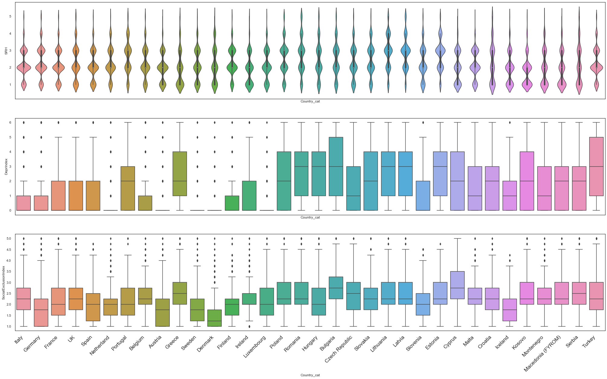
In the figures above we can observe a large variability between the variables of interest for our study. Taking this into consideration, and for simplicity of the model we are going to build in Module 4 in the rest of this section we will focus only in one country, the UK.
df_uk = df11_set.query('Country == 27')
df_uk.describe()
| SRH | DeprIndex | RuralUrban | AccomProblems | HouseholdSize | Children | IncomeQuartiles | WorkingHours | ISCED | Education | SocialExclusionIndex | MentalWellbeingIndex | AgeCategory | Gender | MaritalStatus | Country | ChronicHealth | |
|---|---|---|---|---|---|---|---|---|---|---|---|---|---|---|---|---|---|
| count | 2251.000000 | 2111.000000 | 2239.000000 | 2242.000000 | 2252.000000 | 2248.000000 | 1695.000000 | 50.000000 | 2243.000000 | 2252.000000 | 2160.000000 | 2241.000000 | 2252.000000 | 2252.000000 | 2245.000000 | 2252.0 | 2238.000000 |
| mean | 2.298090 | 1.122217 | 1.531487 | 0.481267 | 2.216252 | 1.716637 | 2.498525 | 40.840000 | 3.997771 | 2.265542 | 2.323611 | 58.456046 | 3.566607 | 1.569272 | 1.928731 | 27.0 | 2.324397 |
| std | 1.025667 | 1.678759 | 0.499119 | 0.874987 | 1.059678 | 1.307691 | 1.119154 | 16.377386 | 1.489030 | 0.593616 | 0.813716 | 22.190912 | 1.221569 | 0.495288 | 1.169388 | 0.0 | 0.886114 |
| min | 1.000000 | 0.000000 | 1.000000 | 0.000000 | 1.000000 | 0.000000 | 1.000000 | 5.000000 | 1.000000 | 1.000000 | 1.000000 | 0.000000 | 1.000000 | 1.000000 | 1.000000 | 27.0 | 1.000000 |
| 25% | 2.000000 | 0.000000 | 1.000000 | 0.000000 | 1.000000 | 1.000000 | 1.000000 | 29.500000 | 3.000000 | 2.000000 | 1.750000 | 44.000000 | 3.000000 | 1.000000 | 1.000000 | 27.0 | 1.000000 |
| 50% | 2.000000 | 0.000000 | 2.000000 | 0.000000 | 2.000000 | 2.000000 | 2.000000 | 42.000000 | 3.000000 | 2.000000 | 2.250000 | 64.000000 | 4.000000 | 2.000000 | 1.000000 | 27.0 | 3.000000 |
| 75% | 3.000000 | 2.000000 | 2.000000 | 1.000000 | 3.000000 | 3.000000 | 3.500000 | 50.000000 | 6.000000 | 3.000000 | 2.750000 | 76.000000 | 5.000000 | 2.000000 | 3.000000 | 27.0 | 3.000000 |
| max | 5.000000 | 6.000000 | 2.000000 | 6.000000 | 4.000000 | 5.000000 | 4.000000 | 80.000000 | 8.000000 | 6.000000 | 5.000000 | 100.000000 | 5.000000 | 2.000000 | 4.000000 | 27.0 | 3.000000 |
Missigness
Lets now investigate the missigness of our variables of interest. There are three categories of missing data: Missing Completely at Random (MCAR), Missing at Random (MAR), Missing Not at Random (MNAR). Understanding the type of missigness present in our dataset is fundamental to justify the use (or dismissal) of a variable in our model. Furthermore, it will help inform the strategy for any kind of imputation done to avoid missing useful data.
# Following command shows missing/non-missing values in two colors.
plt.figure(figsize=(40,40))
sns.displot(
    data=df_uk.isna().melt(value_name="missing"),
    y="variable",
    hue="missing",
    multiple="fill",
    aspect=1.25,
)
plt.show()

print ('Percentage of missing values')
eqls_null_counts = df_uk.isnull().sum() / len(df_uk)
print(eqls_null_counts)
<Figure size 2880x2880 with 0 Axes>
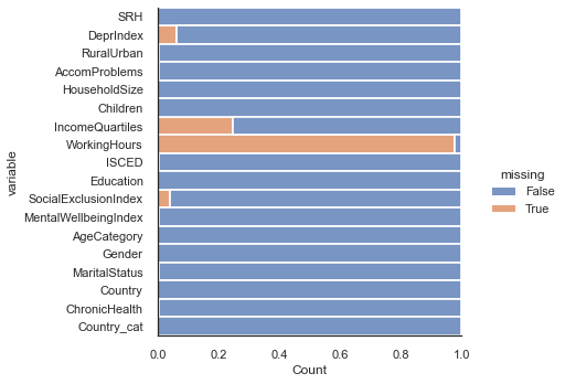
Percentage of missing values
SRH                     0.000444
DeprIndex               0.062611
RuralUrban              0.005773
AccomProblems           0.004440
HouseholdSize           0.000000
Children                0.001776
IncomeQuartiles         0.247336
WorkingHours            0.977798
ISCED                   0.003996
Education               0.000000
SocialExclusionIndex    0.040853
MentalWellbeingIndex    0.004885
AgeCategory             0.000000
Gender                  0.000000
MaritalStatus           0.003108
Country                 0.000000
ChronicHealth           0.006217
Country_cat             0.000000
dtype: float64
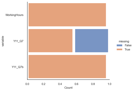
Working Hours is mostly missing. It is derived from two variables, Y11_Q7, Y11_Q7b (a secondary job). A reason for this is that if the person does not have a second job then the total working hours is given as NaN. Let’s explore this further.
df_hours = df11[['WorkingHours','Y11_Q7','Y11_Q7b']]
# Following command shows missing/non-missing values in two colors.
plt.figure(figsize=(40,40))
sns.displot(
    data=df_hours.isna().melt(value_name="missing"),
    y="variable",
    hue="missing",
    multiple="fill",
    aspect=1.25,
)
plt.show()
<Figure size 2880x2880 with 0 Axes>
Dealing with Missingness
In the figure above we can see that only about 40% of respondents filled out the working hours for the first job. Given the large amount of missing data for this variable is probably best to not use it.
Similarly, about 24% of people do not have an estimated IncomeQuartiles. Perhaps these are also unemployed? We could impute, but even sophisticated imputation methods (such as drawing from a distribution specified by the existing values) will introduce randomness (unwanted noise) into the relationships across variables. We could calculate the covariance matrix of the existing data and use that to impute. But similarly that will artificially enhance existing relationships and mean that you are more prone to overfitting.
If we decide to drop the rows with missing data we need to carefully balance any increase of noise by imputation to the loss of statistics of dropping these rows. Furthermore, a research data scientist on this project should try to work with domain experts to uncover if there were any systemic reasons why some entries were missing and therefore by dropping rows we are removing a subpopulation from the dataset.
For example, is it the people that do not have jobs that don’t have incomes? Or perhaps jobless respondents are classed as the first quartile income, and it is something else? This should be done before any imputation methods are considered so that we could assess the extent to which the imputation method is distorting both the distribution of the
IncomeQuartilespredictor and the joint distribution ofIncomeQuartilesand the other variables.
In terms of the the missingness jargon mentioned above (MCAR, MAR, MNAR) the only place where is safe to either drop or blindly impute is when data is missing completely at random in a small scale. And this is almost never the case.
As we are lacking some of this information for this example and a sceptic of adding data just to make your regression work we only select the data where IncomeQuartiles exists if I was to assess IncomeQuartiles as a variable.
Let’s compare IncomeQuartiles to DeprIndex. They both speak to finances and DeprIndex could be used as a replacement.
def plot_mean(data, **kws):
    mn = np.nanmean(data.SRH.values)
    ax = plt.gca()
    ax.axvline(mn, c = (.6,.6,.6), ls ='--')

g = sns.FacetGrid(df_uk, col="IncomeQuartiles", sharey=False)
g.map_dataframe(sns.histplot, 'DeprIndex',binwidth=1,binrange=[-0.5,6.5])


g.map_dataframe(plot_mean)
g.set_axis_labels("Deprivation", "Count")
plt.show()

g = sns.FacetGrid(df_uk, col="DeprIndex", sharey=False)
g.map_dataframe(sns.histplot, 'IncomeQuartiles',binwidth=1,binrange=[0.5,4.5])


g.map_dataframe(plot_mean)
g.set_axis_labels("IncomeQuartiles", "Count")
plt.show()

print(df_uk[['IncomeQuartiles','DeprIndex']].corr(method='spearman'))
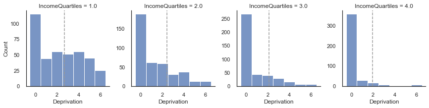
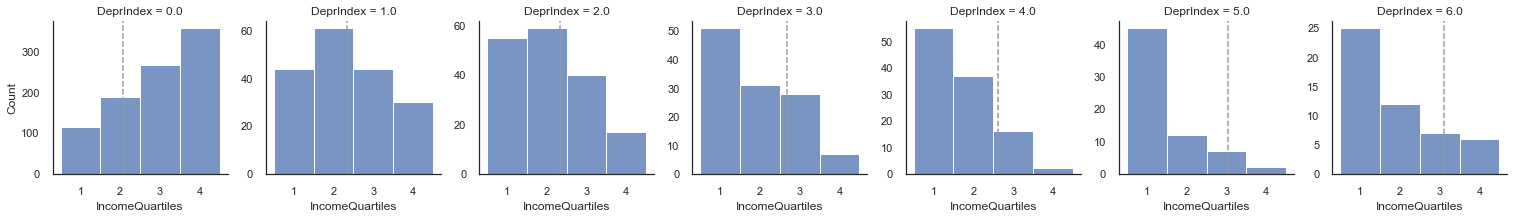
                 IncomeQuartiles  DeprIndex
IncomeQuartiles         1.000000  -0.441867
DeprIndex              -0.441867   1.000000
From the above figure we can see that the distribution of DeprIndex shifts to the left as the income quartile increases (even though zero is the mode throughout). We have plotted it both ways round so better see the relationship.
Though with such a small range of values a correlation is a little unreliable (and is pushed to lower values), we use Spearman’s rank correlation as a rough assessment of whether scoring higher on IncomeQuartiles means that one scores higher on the DeprIndex. You can see that the correlation -.4. This correlation will be dampened by the mode being zero on the DeprIndex.
There is a low amount of data missing in the other variables, with the highest being DeprIndex at 7.6%. If we were to only include rows with a full set of data we would be losing around 11% of our data.
pre_len = len(df_uk)
df11_model = df_uk.drop(columns=['WorkingHours','IncomeQuartiles']).dropna()
print(f"Number of Rows: {len(df11_model)}")
print(f"Percentage excluded: {((pre_len - len(df11_model)) / pre_len)*100}%")
Number of Rows: 1984
Percentage excluded: 11.900532859680284%
Relationships between variables
Let’s now investigate the relationship between our variables variable of interest. This can help us understand how important these will become in our model.
Notice that we have left a health variable within our selected set variables. This is done just as example for this exercise. Any variable under health should be treated as a candidate dependent measure rather than a predictor. These should correlate with SRH, but in a trivial manner. If we were to include these in the model then we would be assessing a person’s ability to monitor their own health, which is not our research questions.
From the data map, self-reported health is Y11_Q42. The derived health value indicating chronic health problems is DV_Q43Q44 and we have renamed it as ChronicHealth. We can see for from the plots below that as the chronic health variable increases in severity self-reported health gets worse.
g = sns.FacetGrid(df11_model, col="ChronicHealth", sharey=False)
g.map_dataframe(sns.histplot, 'SRH',binwidth=1,binrange=[0.5,5.5])

g.map_dataframe(plot_mean)
g.set_axis_labels("SRH", "Count")
plt.show()

print(df_uk[['ChronicHealth','SRH']].corr(method='spearman'))
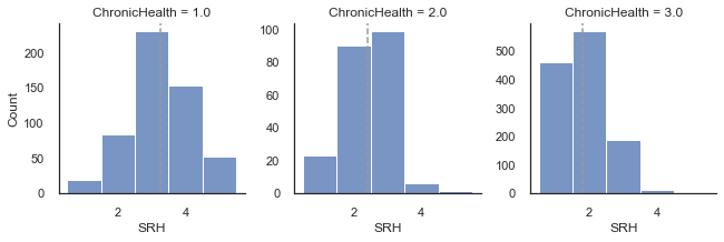
               ChronicHealth       SRH
ChronicHealth       1.000000 -0.607767
SRH                -0.607767  1.000000
We won’t be using any health related variables in our model. Let’s have a look at the other variables.
We can use the seaborn pairplot function to plot multiple pairwise bivariate distributions in our dataset. This shows the relationship for all pair combination of variables in the DataFrame as a matrix of plots and the diagonal plots are the univariate plots.
# to more easily to differences let's cap the correlation cmap
sns.pairplot(df11_model[['SRH', 'DeprIndex', 'RuralUrban', 'AccomProblems', 'HouseholdSize',
       'Children', 'ISCED', 'Education', 'SocialExclusionIndex',
       'MentalWellbeingIndex', 'AgeCategory', 'Gender', 'MaritalStatus', 'ChronicHealth']])
plt.show()
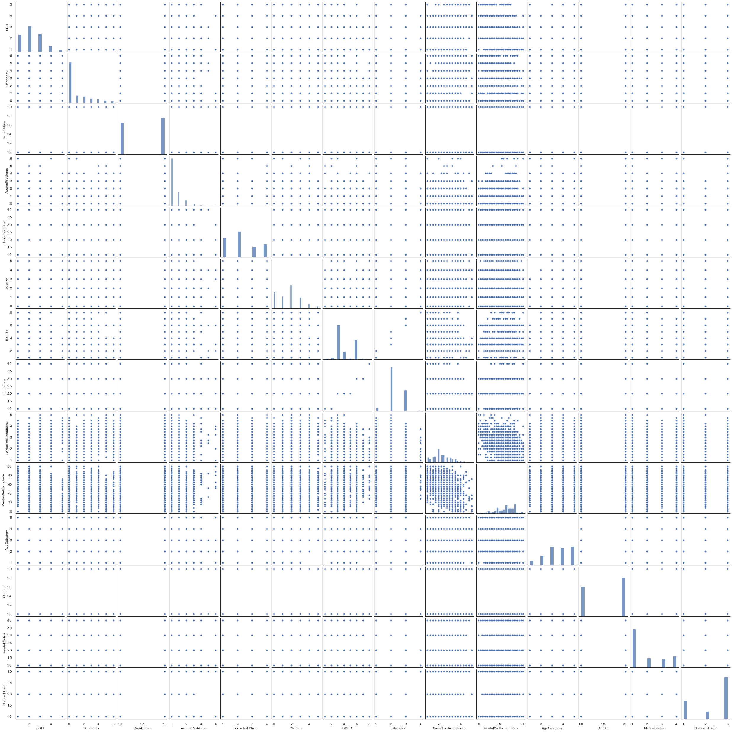
As most our variables are ranks or categories, the plot matrix above might not be the best to visualise the relationships between variables. In this case is better to look at the rank correlations. Still, we take these with a pinch of salt because some variables are categorical rather than ordinal/numeric so the rank has little meaning (e.g., RuralUrban).
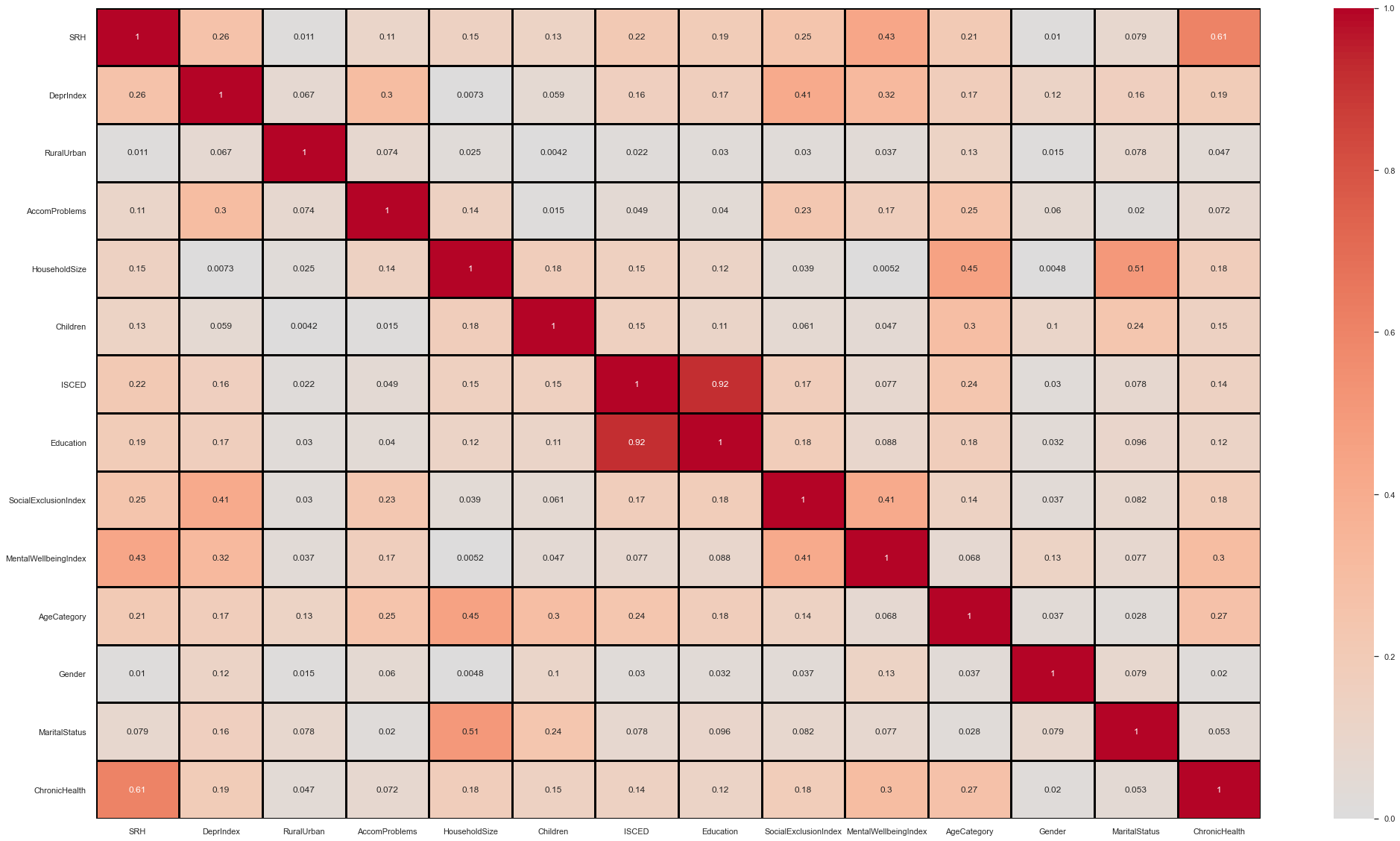
Some initial observations on the below correlation matrix:
Age correlates with a few variables. Especially SRH + Children
Lots of variables correlate with SRH.
DeprIndex, MentalWellbeing Index and Social Exclusion Index all correlate with one another.
DeprIndex correlates with quite a few variables (SRH, AccomProblems, Education).
# to more easily to differences let's cap the correlation cmap
f, axes = plt.subplots(figsize =(35,20))

sns.heatmap(abs(df11_model.drop(columns=['Country']).corr(method='spearman')), annot = True, vmin=0, vmax=1, center= 0., linewidths=3, linecolor='black',cmap= 'coolwarm')

plt.show()
Next we can go through each loose grouping of material, occupational and psychosocial to assess the suitability of variables to include in our model.
Material variables
Let’s examine the extent to which the material variables are getting at representing similar things.
Some initial thoughts:
- You would expect that has DeprIndex goes up AccomProblems will also go up since the persons cannot afford to remedy accommodation issues.
- RuralUrban only has two categories so doesn’t lend itself to correlational analysis. Whether people are better off in the city, or the country depends on many factors (and varies between country).
- You would expect HouseholdSize and Children to be similar because Children counts towards household size (but HouseholdSize stops at >=4).
df_mat = df11_model[['DeprIndex','RuralUrban','AccomProblems','HouseholdSize','Children']]
print(df_mat.corr(method='spearman'))

df_mat=df_mat.groupby(by=['HouseholdSize','Children']).size().reset_index(name='counts')
df_mat = df_mat.pivot("HouseholdSize", "Children", "counts")

sns.heatmap(df_mat, cmap="YlGnBu")
plt.show()
               DeprIndex  RuralUrban  AccomProblems  HouseholdSize  Children
DeprIndex       1.000000    0.067098       0.299665       0.007266  0.059037
RuralUrban      0.067098    1.000000       0.074348       0.024762  0.004160
AccomProblems   0.299665    0.074348       1.000000       0.144886 -0.014654
HouseholdSize   0.007266    0.024762       0.144886       1.000000  0.177397
Children        0.059037    0.004160      -0.014654       0.177397  1.000000
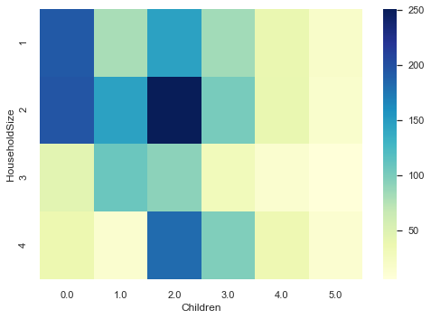
HouseholdSize does not appear to monotonically increase with Children. Probably the mediation here is Age. One can live alone but have five children who each have their own households.
df_mat=df11_model[['DeprIndex','RuralUrban','AccomProblems','HouseholdSize','Children']].groupby(by=['DeprIndex','AccomProblems']).size().reset_index(name='counts')
df_mat = df_mat.pivot("DeprIndex", "AccomProblems", "counts")
print(df_mat)
# 0,0 will overwhelm the heatmap. Let's cap it.
sns.heatmap(df_mat, cmap="YlGnBu", vmax=300)
plt.show()
AccomProblems    0.0    1.0   2.0   3.0  4.0  5.0  6.0
DeprIndex
0.0            935.0  188.0  40.0  15.0  2.0  NaN  3.0
1.0            145.0   49.0  17.0   7.0  1.0  NaN  3.0
2.0            115.0   43.0  29.0   5.0  4.0  NaN  NaN
3.0             66.0   43.0  25.0   6.0  NaN  NaN  NaN
4.0             52.0   31.0  21.0   5.0  2.0  2.0  NaN
5.0             28.0   22.0  11.0   7.0  5.0  1.0  NaN
6.0             30.0   15.0   6.0   3.0  2.0  NaN  NaN
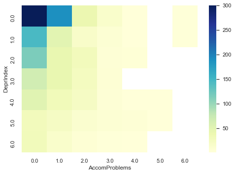
There is a bias for zero accommodation problems but as deprivation increases the amount of accommodation problems tends to increase.
Self reported health for the UK
One thing we haven’t done so far is look at the full SRH distribution for the UK.
fig, axes = plt.subplots(1,2, figsize=(12,5))
sns.histplot(data=df_uk, x='SRH', ax=axes[0],binwidth=1,binrange=[0.5,5.5])
sns.histplot(data=df_uk, x='DeprIndex', ax=axes[1],binwidth=1,binrange=[0.5,6.5])
plt.show()
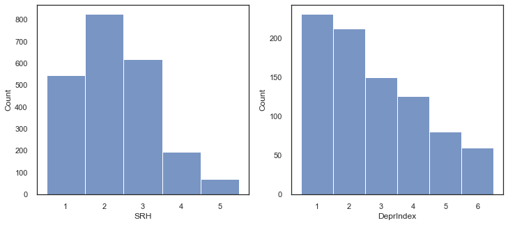
You can see that in the UK dataset, as with the global dataset, most of DeprIndex responses were zero (right graph above). In the left panel we have SRH. The responses here are:
1: Very good
2: Good
3: Fair
4: Bad
5: Very Bad.
The positive skew (i.e., the mean will be to the right of the median) shows that participants felt more healthy than unhealthy.
The paper uses the 2003 EQLS dataset which has the answers of [“excellent”, “very good”, “good”, “fair”, “poor”]. The variable was dichotomised for ease of use with logistic regression as “good” health [“excellent”, “very good”, “good”] and “poor” health [“fair”, “poor”].
Here we have different names of the responses. If we must dichotomise then the debate is around whether to categorise “fair” as good or bad health, since arguably the word semantically means good health rather than poor health. Let’s follow the paper and have a 3-2 split with (“bad”, “very bad”) comprising the negative group.