3.4 Storytelling with data visualisation
Contents
3.4 Storytelling with data visualisation
What is a story
A story is a connected series of events presented in a specific order such that they create an emotional reaction for a given audience.
In our case, a story is told through visuals of statistical information. Ideally, these create a compelling narrative that convinces the audience of the importance of your data insight.
Audience
Telling a story starts with the audience. The starting point of your visualisation’s story is the audience’s domain-relevant knowledge. The audience’s context should frame your story.
However, even experts in a field take time to process complex visualisations. Assume that the reader needs as much help as possible from you to understand the key trends and relationships shown. Keep your figures simple, avoid irrelevant or tangential information, and augment your visuals with narrative text that will help the readers infer the intended conclusions about your data.
Tell one story
Although it is possible (and far too easy with modern visualisation packages!) to tell many stories using a single chart, it is easy to overload your audience with information. Every addition to a figure increases the required mental effort of your audience. Too much information is confusing - the reader does not know what to focus on, and your figure is diminished. Aim for ink parsimony, be careful to include only the visual elements that increase understanding, and embrace white space. Remember you are competing for the viewer’s time and attention!
Having said all this, sometimes a single static visualisation is not enough to tell an entire story. You may want to design a sequence of simple figures that jointly create a convincing story arc. When connecting a story over multiple figures consider using different types of visualisation for each distinct analysis to help the reader’s focus. Furthermore, keep semantic indicators (such as colour scheme) consistent across figures. If you have many similar types of analysis an alternative is to use interactive figures and animations that enable the audience to navigate through the story.
A great example of data journalism following the above principles comes from the Financial Times Covid-19: The global crisis — in data.
Titles and annotations
The first thing that your reader will see is the title of your visualisation, so it is important at this point that the title not only describes what is being measured, but also why the reader should care and how to read the chart.
Depending on the audience and the story you want to tell, the title can adopt different styles (from here): - Descriptive title: This is more appropriate for technical audiences with a background knowledge of the topic. It gives a neutral overview of the analysis being presented. - Definitive statement: Suitable for general audiences, it communicates clearly your message and the insights. - Question: Posing a clear question in your title and providing an answer to it with the data will transmit a clear message to your audience (suitable for non-technical audiences).
You can also use subtitles to strengthen your message and provide more depth on the insight obtained from the data. If your audience has no prior knowledge on the data, annotations can improve the figure’s readability and provide additional detail.
Hierarchy of the information
Consider how your audience will scan and read the visualisation.
Without any visual cues, when we’re confronted with a block of text our only option is to read it.
We can employ preattentive (subconscious processing) attributes to create a visual hierarchy in our communications. These attributes can be colour, contrast, font, size, etc.
For example, look at the figure from the European Environment Agency shown below. If many data are displayed, we can make use of white space to separate and group the information. Text formatting can allow us to give the desired hierarchy to the content and colours help us to highlight the focus of the data visualisation.

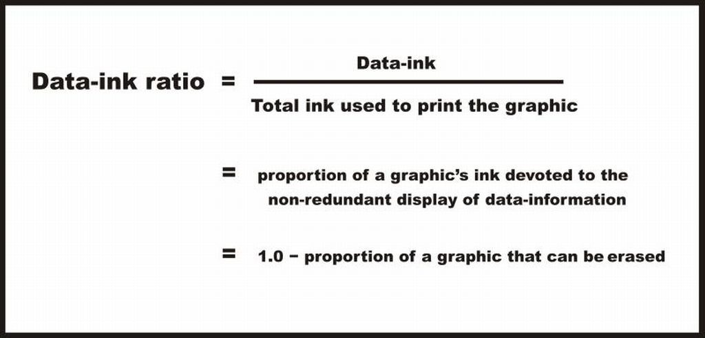
Data-ink ratio
The data-ink ratio is a concept introduced by Edward Tufte, an expert
on designing effective data visualisations.
Best practices used in data visualisation, story-telling and information design are highly influenced by the renowned statistical graphics expert Edward Tufte. An excellent visualization, according to Tufte, expresses “complex ideas communicated with clarity, precision and efficiency.” In 1980s, Tufte proposed a metric for measuring the amount of superfluous information included in a chart. He called it the data-ink ratio, saying “the larger the share of a graphic’s ink devoted to data, the better.”
The term, ‘data-ink’, is defined as the total ink on a graph that represents data. And the data-ink ratio is the proportion of a graphic’s ink devoted to the non-redundant display of data-information.
Tufte claims that good graphical representations are designed with ta data-ink ratio as close as possible to 1.0 as possible, without eliminating something that is necessary for effective communication.
Tufte puts forward the following 5 principles related to data ink when designing a data visualisation:
Above all else show data.
Maximize the data-ink ratio.
Erase non-data-ink.
Erase redundant data-ink.
Revise and edit.
Emotion and context in story telling
Emotion
Discussing data-ink ratios (see section above) and information can feel cold and calculating, contradictory to the idea that a good story takes the reader through an emotional journey. The emotional component of the story is what grabs your attention and makes the story memorable.
So how can you invoke emotion and minimize the data-ink ratio? In this course we do not aim to provide a clear answer for this, but we want to use an example to get you to think about it.
This comparison comes from the Data Feminism book. They compare two different ways of visualising the same problem: gun violence in the US. The first figure is a typical bar chart from the Washington Post showing a bar chart with the number of active shooter incidents annually. The second figure comes from Periscope, a design firm with the tag line “Do good with data”, that took a different approach. Quoting the Data Feminism book (D’Ignazio and Klein, 2020):
“… what makes Periscopic’s visualization so very different from a more conventional bar chart of similar information, such as “The Era of ‘Active Shooters’” from the Washington Post? The projects share the proposition that gun deaths present a serious threat. But unlike the Washington Post bar chart, Periscopic’s work is framed around an emotion: loss. People are dying; their remaining time on earth has been stolen from them. These people have names and ages. They have parents and partners and children who suffer from that loss as well.”
 A bar chart with the number of
“active shooters incidents” from the United States between 2000 and
2015.
A bar chart with the number of
“active shooters incidents” from the United States between 2000 and
2015.
 Visualisation of the “stolen years”
of people killed by guns in the United States in 2013. Figure by
Periscope.
Visualisation of the “stolen years”
of people killed by guns in the United States in 2013. Figure by
Periscope.
Context
In the previous sections we have emphasised how to use data storytelling to convey a message through emotion. It is clear that tailoring a story in this way can never be neutral or objective. However, this is not only limited to a story or message. Data is never neutral or objective and there is no such thing as “raw data” (discussed in Section 1.1)
Instead of taking data at face value and looking toward future insights, data scientists must work with domain experts to first interrogate the context, limitations, and validity of the data being used. Furthermore, this should not limit itself to the stages of data acquisition or data analysis, context also comes into play in the framing and communication of results.
The following example from the Data Feminism book shows data resulting from a research study called “Disparities in Mental Health Referral and Diagnosis in the New York City Jail Mental Health Service.” This study looked at the medical records of tens of thousands of first-time incarcerated people and finds that some groups (white people) are more likely to receive treatment, while others (Black and Latinos) are more likely to receive punishment such as solitary confinement.
The figures below shows two examples of how varying the titles can frame the figure in a different context. The figure in the left seems neutral and free of bias however does not succeed in communicating the research findings. The figure in the right attempts to fix that by changing the annotations of the figure to add necessary context.

Two portrayals of the same data analysis. Data from Fatos Kaba et
al. “Disparities in Mental Health Referral and Diagnosis in the New York
City Jail Mental Health Service”. Graphics by Catherine D’Ignazio,
extracted from Data Feminism (D’Ignazio and Klein, 2020).
Extra resources
Check out the page of Turing Data Stories. A Turing project that experiments with different ways of doing story-telling in a pedagogical, ethical and reproducible fashion.
Group Discussion We have said that data is never completely objective. Is this true? How would be visualise data that is potentially emotive but you want to keep as objective as possible?