3.3 Plotting with Matplotlib
Contents
3.3 Plotting with Matplotlib#
Estimated time to complete this notebook: 25 minutes
3.3.1 Importing Matplotlib#
We import the pyplot object from Matplotlib, which provides us with an interface for making figures.
We usually abbreviate it.
from matplotlib import pyplot as plt
3.3.2 Notebook magics#
When we write:
%matplotlib inline
We tell the Jupyter notebook to show figures we generate alongside the code that created it, rather than in a separate window. Lines beginning with a single percent are not python code: they control how the notebook deals with python code.
Lines beginning with two percent signs are “cell magics”, that tell Jupyter notebook how to interpret the particular cell;
we’ve seen %%writefile and %%bash for example.
3.3.3 A basic plot#
When we write:
from math import cos, pi, sin

myfig = plt.plot([sin(pi * x / 100.0) for x in range(100)])
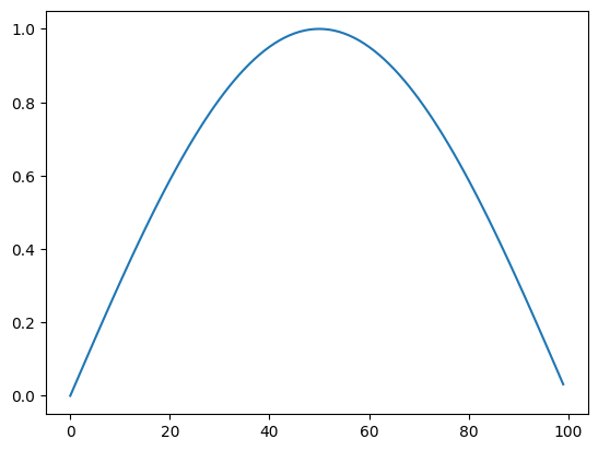
The plot command returns a figure, just like the return value of any function. The notebook then displays this.
To add a title, axis labels etc, we need to get that figure object, and manipulate it. For convenience, matplotlib allows us to do this just by issuing commands to change the “current figure”:
plt.plot([sin(pi * x / 100.0) for x in range(100)])
plt.title("Hello")
Text(0.5, 1.0, 'Hello')
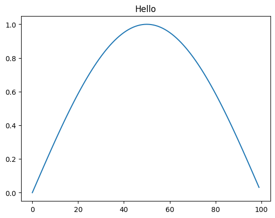
But this requires us to keep all our commands together in a single cell, and makes use of a “global” single “current plot”, which, while convenient for quick exploratory sketches, is a bit cumbersome.
If we want to produce publication-quality plots from our notebook, matplotlib, defines some types we can use to treat individual figures as variables, and manipulate these.
3.3.4 Figures and Axes#
We often want multiple graphs in a single figure (e.g. for figures which display a matrix of graphs of different variables for comparison).
So Matplotlib divides a figure object up into axes: each pair of axes is one ‘subplot’.
To make a boring figure with just one pair of axes, however, we can just ask for a default new figure, with
brand new axes.
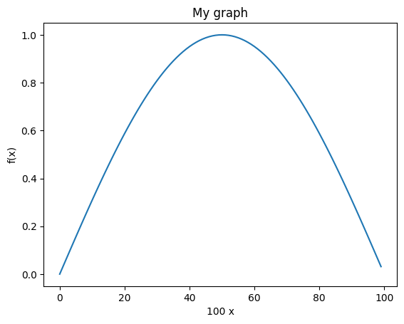
The relevant function returns a (figure, axis) pair, which we can deal out with parallel assignment.
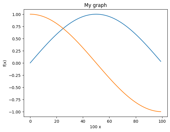
sine_graph, sine_graph_axes = plt.subplots()
Once we have some axes, we can plot a graph on them:
sine_graph_axes.plot([sin(pi * x / 100.0) for x in range(100)], label="sin(x)")
[<matplotlib.lines.Line2D at 0x7f3edccb4eb0>]
We can add a title to a pair of axes:
sine_graph_axes.set_title("My graph")
Text(0.5, 1.0, 'My graph')
sine_graph_axes.set_ylabel("f(x)")
Text(4.444444444444445, 0.5, 'f(x)')
sine_graph_axes.set_xlabel("100 x")
Text(0.5, 4.444444444444445, '100 x')
Now we need to actually display the figure. As always with the notebook, if we make a variable be returned by the last line of a code cell, it gets displayed:
sine_graph
We can add another curve:
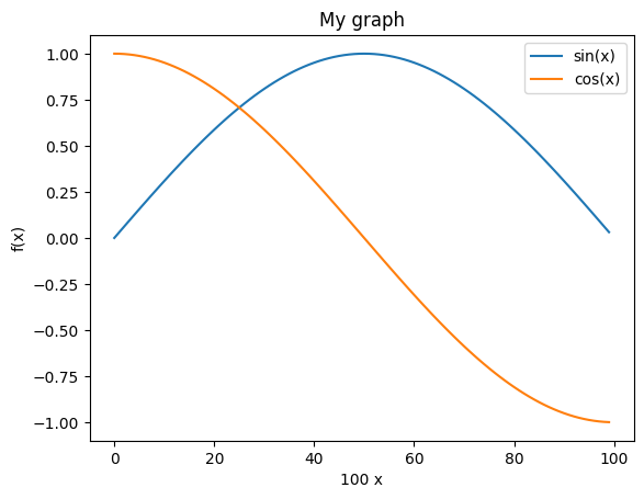
sine_graph_axes.plot([cos(pi * x / 100.0) for x in range(100)], label="cos(x)")
[<matplotlib.lines.Line2D at 0x7f3edcc49ee0>]
sine_graph
A legend will help us distinguish the curves:
sine_graph_axes.legend()
<matplotlib.legend.Legend at 0x7f3f00fe77f0>
sine_graph
3.3.5 Saving figures#
We must be able to save figures to disk, in order to use them in papers. This is really easy:
sine_graph.savefig("my_graph.png")
In order to be able to check that it worked, we need to know how to display an arbitrary image in the notebook.
The programmatic way is like this:
# Use the notebook's own library for manipulating itself.
from IPython.display import Image

Image(filename="my_graph.png")
3.3.6 Subplots#
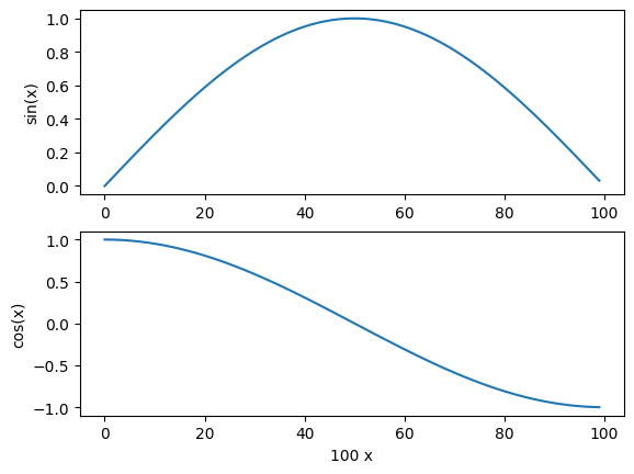
We might have wanted the \(\sin\) and \(\cos\) graphs on separate axes:
double_graph = plt.figure()
<Figure size 640x480 with 0 Axes>
sin_axes = double_graph.add_subplot(2, 1, 1) # 2 rows, 1 column, 1st subplot
cos_axes = double_graph.add_subplot(2, 1, 2)
double_graph
sin_axes.plot([sin(pi * x / 100.0) for x in range(100)])
[<matplotlib.lines.Line2D at 0x7f3edc9d91c0>]
sin_axes.set_ylabel("sin(x)")
Text(4.444444444444445, 0.5, 'sin(x)')
cos_axes.plot([cos(pi * x / 100.0) for x in range(100)])
[<matplotlib.lines.Line2D at 0x7f3edccb4f10>]
cos_axes.set_ylabel("cos(x)")
Text(4.444444444444445, 0.5, 'cos(x)')
cos_axes.set_xlabel("100 x")
Text(0.5, 4.444444444444445, '100 x')
double_graph
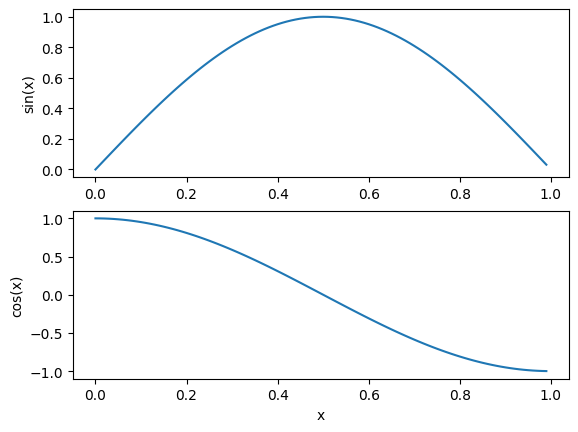
3.3.7 Versus plots#
When we specify a single list to plot, the x-values are just the array index number.
We usually want to plot something more meaningful:
double_graph = plt.figure()
sin_axes = double_graph.add_subplot(2, 1, 1)
cos_axes = double_graph.add_subplot(2, 1, 2)
cos_axes.set_ylabel("cos(x)")
sin_axes.set_ylabel("sin(x)")
cos_axes.set_xlabel("x")
Text(0.5, 0, 'x')
sin_axes.plot(
    [x / 100.0 for x in range(100)], [sin(pi * x / 100.0) for x in range(100)]
)
cos_axes.plot(
    [x / 100.0 for x in range(100)], [cos(pi * x / 100.0) for x in range(100)]
)
[<matplotlib.lines.Line2D at 0x7f3edc5819d0>]
double_graph
3.3.8 Sunspot Data#
We can incorporate what we have learned in the sunspots example to produce graphs of the data.
import pandas as pd

df = pd.read_csv(
    "http://www.sidc.be/silso/INFO/snmtotcsv.php",
    sep=";",
    header=None,
    names=["year", "month", "date", "mean", "deviation", "observations", "definitive"],
)
df.head()
| year | month | date | mean | deviation | observations | definitive | |
|---|---|---|---|---|---|---|---|
| 0 | 1749 | 1 | 1749.042 | 96.7 | -1.0 | -1 | 1 |
| 1 | 1749 | 2 | 1749.123 | 104.3 | -1.0 | -1 | 1 |
| 2 | 1749 | 3 | 1749.204 | 116.7 | -1.0 | -1 | 1 |
| 3 | 1749 | 4 | 1749.288 | 92.8 | -1.0 | -1 | 1 |
| 4 | 1749 | 5 | 1749.371 | 141.7 | -1.0 | -1 | 1 |
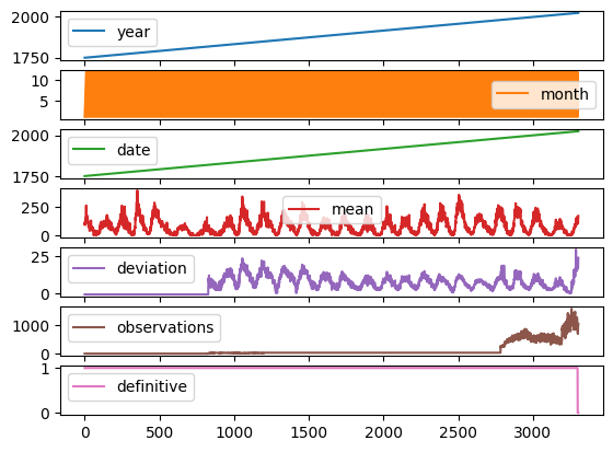
We can plot all the data in the dataframe separately, but that isn’t always useful!
df.plot(subplots=True)
array([<Axes: >, <Axes: >, <Axes: >, <Axes: >, <Axes: >, <Axes: >,
       <Axes: >], dtype=object)
Let’s produce some more meaningful and useful visualisations by accessing the dataframe directly.
We start by discarding any rows with an invalid (negative) standard deviation.
df = df[df["deviation"] > 0]
Next we use the dataframe to construct some useful lists.
deviation = df["deviation"].tolist()  # Get the dataframe column (series) as a list
observations = df["observations"].tolist()
mean = df["mean"].tolist()
date = df["date"].tolist()
fig = plt.figure(
    figsize=(15, 10)
)  # Set the width of the figure to be 15 inches, and the height to be 5 inches

ax1 = fig.add_subplot(2, 2, 1)  # 2 rows, 2 columns, 1st subplot
ax1.errorbar(
    df["date"],  # Date on the x axis
    df["mean"],  # Mean on the y axis
    yerr=df["deviation"],  # Use the deviation for the error bars
    color="orange",  # Plot the sunspot (mean) data in orange
    ecolor="black",
)  # Show the error bars in black
ax1.set_xlabel("Date")
ax1.set_ylabel("Mean")
ax1.set_title("From Dataframe")

ax2 = fig.add_subplot(2, 2, 2)  # 2 rows, 2 columns, 2nd subplot
ax2.scatter(df["date"], df["observations"], color="grey", marker="+")
ax2.set_xlabel("Date")
ax2.set_ylabel("Number of Observations")
ax2.set_title("From Dataframe")

ax3 = fig.add_subplot(2, 2, 3)  # 2 rows, 2 columns, 3rd subplot
ax3.errorbar(date, mean, yerr=deviation, color="pink", ecolor="black")
ax3.set_xlabel("Date")
ax3.set_ylabel("Mean")
ax3.set_title("From List")

ax4 = fig.add_subplot(2, 2, 4)  # 2 rows, 2 columns, 4th subplot
ax4.scatter(date, observations, color="red", marker="o")
ax4.set_xlabel("Date")
ax4.set_ylabel("Number of Observations")
ax4.set_title("From List")
Text(0.5, 1.0, 'From List')
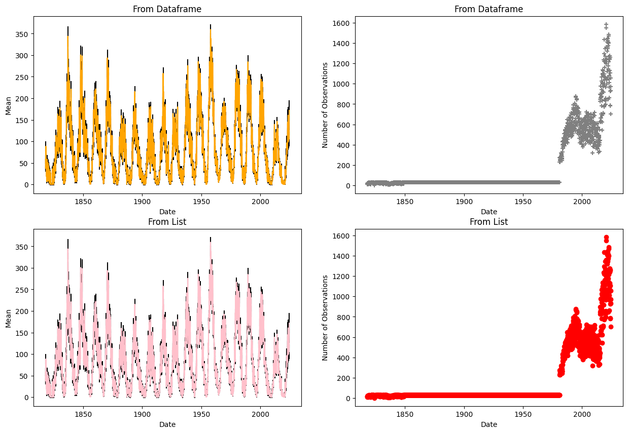
In this example we are plotting columns from the pandas DataFrame (series), and from lists to show this method works for both.
numpy arrays can also be used.
3.3.9 Learning More#
There’s so much more to learn about matplotlib: pie charts, bar charts, heat maps, 3-d plotting, animated plots, and so on.
You can learn all this via the Matplotlib Website.
You should try to get comfortable with all this, so please use some time in class, or at home, to work your way through a bunch of the examples.